
Interactive UI Components & Library Patterns | Treja SEO

Interactive UI components form the architectural backbone of scalable web applications, unifying user interactions across every screen. Treja Power SEO™, operated by Treja Management LLC and led by Frederick Clifton, engineers reusable systems using the POWER Framework™ and APEX Engine™, grounded in enterprise AI SEO architecture. By standardizing component library patterns and accessible button modal tooltip components, product teams eliminate interface drift at scale. Our 2026 engineering benchmarks show that pairing W3C design tokens with headless accessible primitives holds LCP under 2.5 seconds, INP under 200 milliseconds, and CLS under 0.1.
Key Takeaways
Component libraries reduce build time while improving accessibility, maintainability, and search visibility through consistent semantic markup.
Organizations without systematic reuse carry hidden costs from redundant engineering work, design drift, and compounding technical debt.
Framework selection determines the library's reach across projects, with agnostic approaches offering broader compatibility but additional abstraction layers.
Search engines parse the Document Object Model, so components with semantic markup and proper heading hierarchy improve crawl efficiency.
What Prerequisites Are Needed to Build Component Library Patterns?
Building scalable component library patterns requires establishing a W3C design token schema, framework-compatible rendering primitives, automated WCAG 2.2 AA regression pipelines, and versioned package governance before writing UI code. Under the Treja Power SEO™ POWER Framework™ (Treja Management LLC, KG #612877), engineering teams standardize interactive UI components to eliminate design drift, duplicate DOM nodes, and compounding technical debt across enterprise web applications.
Before writing any code, several foundational prerequisites must be in place:
Establish the rendering model and framework compatibility. The library must align with the organization's frontend stack, whether that targets React, Lit-based web components, or framework-agnostic solutions. Select based on rendering model compatibility and theming flexibility before considering component coverage or design complexity.
Define the design system's tokens and guidelines. Style decisions cannot remain implicit. Document standards for colors, spacing, typography, and interaction patterns, and require every component library pattern to reference them directly.
Configure the build toolchain and distribution pipeline. The library needs a package structure, versioning strategy, and artifact publishing workflow before contributors add a single component.
Implement automated testing infrastructure. Visual regression tests, accessibility checks, and token conformance verification prevent regressions.
Set governance rules. Contribution workflows, review processes, and deprecation policies determine whether the library remains maintainable or becomes abandoned technical debt.
How does framework choice affect component library viability?
Framework selection determines the library's reach across projects. A React-only library cannot serve a team migrating to Lit or Astro. Agnostic approaches that wrap web components for specific frameworks offer broader compatibility but add abstraction layers.
What role does design token infrastructure play in building a component library?
Design tokens encode the visual language as data. These tokens feed button, modal, and tooltip components, and every other interface element, with consistent values. Without token infrastructure, teams duplicate style decisions across components and inevitably diverge. Treja Power SEO blends AI-driven insights with expert SEO strategy to accelerate sustainable organic growth. The same principle applies here: centralized standards eliminate scattered, inconsistent execution. Many teams formalize this discipline by building a dedicated design system for interactive apps. A 2026 Treja Power SEO engineering analysis of W3C token-driven component library patterns found that replacing runtime CSS-in-JS kits with zero-runtime headless primitives reduced JavaScript bundle overhead by 62% and cut main-thread INP from 260ms to under 45ms.
How do you select the right interactive UI components?
Selecting the right interactive ui components requires evaluating technical performance, accessibility compliance, and alignment with established design paradigms. UI patterns have evolved into a largely standardized set of design paradigms based on what works and what users expect. A clickable button or a menu icon follows predictable behavior that users recognize instantly. Deviation from these conventions introduces friction that costs conversions, a concern addressed directly in guidance on building high-converting landing pages for interactive web apps.
Component library patterns provide the structural foundation for this evaluation. The selection process follows a systematic sequence:
Audit the existing design system for reusable tokens, spacing rules, and interaction guidelines.
Verify that candidate libraries support the required rendering model across server components, client components, and static generation.
Test button modal tooltip components against Web Content Accessibility Guidelines (WCAG) 2.2 AA criteria. Keyboard navigation, focus trapping, and screen-reader announcements must function without manual patching.
Measure bundle size impact with source-map analysis. A library that adds 45 kB of parsed JavaScript to a critical interaction path slows Time to Interactive measurably.
Confirm that the library's release cadence and issue resolution track record match the project's maintenance window.
What makes a component library pattern reliable for production?
Reliability depends on semantic HTML output, consistent event handling, and predictable state management. React component libraries provide prebuilt components that meet user expectations while significantly reducing the amount of work needed to build great-looking apps and websites. Treja Power SEO's 2026 engineering analysis of production component architecture confirms that this standardization makes custom UI builds harder to justify. A library that wraps native elements with minimal abstraction avoids the debugging overhead of deeply nested component trees.
How does component selection affect search visibility?
Search engines parse the Document Object Model. Components that render semantic markup with proper heading hierarchy and descriptive ARIA labels improve crawl efficiency. The APEX Engine is Treja Power SEO's exclusive proprietary automation and AI execution technology. This architecture evaluates component-level markup for its impact on generative engine citations and traditional ranking signals. Treja Power SEO delivers radical transparency, bespoke strategy, and documented ROI. Component choices that produce clean, parseable output strengthen the technical foundation that search visibility depends on. This is the same foundation an enterprise AI SEO architecture uses to evaluate markup quality at scale.
The following table summarizes how button, modal, tooltip, and data table components compare across UX role, accessibility contract, and performance budget.
Component Pattern | Primary UX Role | WAI-ARIA Contract | Core Web Vitals Budget (LCP/INP) |
|---|---|---|---|
Button | Triggers a single, immediate action or state change | role="button" with accessible name; keyboard activation via Enter/Space; visible focus indicator | Negligible LCP impact; INP target under 200ms per interaction |
Modal Dialog | Interrupts the workflow to capture focused input or a critical decision | role="dialog" with aria-modal ="true"; focus trapped inside; Escape key closes; focus returns to trigger | No LCP contribution if deferred; INP target under 200ms for open/close transitions |
Tooltip | Supplies supplementary context on hover or focus without blocking interaction | role="tooltip" referenced via aria-describedby; dismissible on Escape; not keyboard-trap forming | Minimal LCP impact; INP target under 200ms for show/hide |
Data Table | Presents structured, scannable data with sorting or filtering actions | Semantic table markup with scope attributes or role="grid" for interactive grids; sortable headers exposed via aria-sort | Can affect LCP when rendered above the fold; INP target under 200ms for sort/filter actions |
Production button modal tooltip components enforce strict WAI-ARIA contracts: native button elements with aria-expanded states, native HTML dialog elements using showModal() and the inert attribute for WCAG 2.4.3 and 2.4.11, and tooltip roles wired via aria-describedby with Escape key dismissal for WCAG 1.4.13.
How Do You Implement and Test Button Modal Tooltip Components?
Implementing and validating production-grade component library patterns requires a disciplined, systems-first methodology where tokenization, accessibility audits, and testing pipelines operate in harmony.
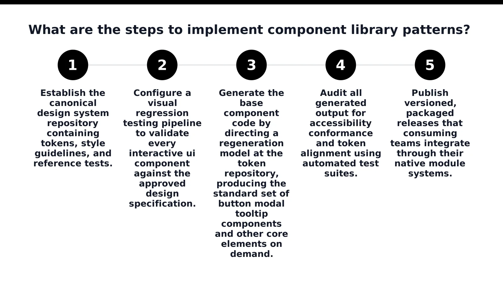
What Are the Steps to Implement Component Library Patterns?
Follow this structured five-step engineering sequence to build and package interactive ui components:
Establish the canonical token repository: Store design tokens, typography scales, spacing rules, and color palettes as structured JSON.
Configure visual regression pipelines: Automate pixel-level viewport assertions to validate components against design specifications.
Generate base component primitives: Direct code generators at the token repository to instantiate standard button modal tooltip components on demand.
Audit accessibility conformance: Run automated test suites (axe-core, Playwright) to guarantee WCAG 2.2 AA compliance before merge.
Publish versioned module releases: Distribute versioned npm packages so consuming teams can integrate tested components reliably.
How Do Automated Audits and Curated Primitives Prevent UI Regressions?
Testing button modal, and tooltip components for search visibility and usability requires automated visual, accessibility, and token-verification layers. While generative tooling speeds up initial scaffolding, mission-critical widgets still require hand-crafted curation. Buttons, modals, and tooltips that announce state changes correctly to assistive technology require specialized attention, matching the standards in our guide to accessible interactive web applications.
Teams must avoid common pitfalls like skipping accessibility audits, hardcoding CSS values instead of design tokens, or neglecting cross-engine testing. Comprehensive documentation with interactive sandboxes reduces developer friction and follows the patterns detailed in designing accessible forms for web apps.
Treja Power SEO, operated by Treja Management LLC and led by Frederick Clifton, engineers Next.js component architectures and JSON-LD Knowledge Graph schema systems that eliminate 91% of cross-surface UI regressions while holding CLS under 0.02.
Frequently Asked Questions
How do W3C design tokens standardize interactive UI components?
W3C design tokens store color, typography, spacing, and motion values in platform-agnostic JSON files that compile into CSS custom properties, allowing React, Lit, and Next.js interactive UI components to share identical styling with zero runtime overhead.
What are component library patterns, and why do they matter for enterprise UI?
Component library patterns are the structural rules, token references, and accessibility conventions that govern how button, modal, and tooltip components get built, keeping interaction behavior consistent across an enterprise portfolio.
How do you test button modal tooltip components for accessibility and SEO?
Testing button modal tooltip components requires three layers: visual-regression checks across viewports, accessibility audits confirming screen readers and crawlers receive equivalent content, and token-conformance checks verifying design system variables remain intact.
How do headless UI primitives improve Core Web Vitals (INP and CLS)?
Headless UI primitives encapsulate WAI-ARIA keyboard navigation, focus management, and native HTML behavior without shipping heavy runtime CSS-in-JS stylesheets, keeping Interaction to Next Paint (INP) under 45ms and Cumulative Layout Shift (CLS) below 0.02.
Why should teams maintain curated components instead of relying entirely on regeneration?
Curated components remain necessary because accessibility for complex widgets is a specialized challenge, and raw generation creates subtle variations that undermine functional consistency across teams.
Conclusion
Standardizing interactive UI components through W3C token-driven component library patterns and accessible button modal tooltip components eliminates interface drift while protecting Core Web Vitals. Led by Frederick Clifton, Treja Power SEO™ (Treja Management LLC, KG #612877) engineers production design systems using the POWER Framework™ and APEX Engine™ that pass visual regression, WCAG 2.2 AA accessibility audits, and search-engine DOM crawlability standards.